2020 Electoral Maps from Princeton Election Consortium
This series of maps is derived from the Princeton Election Consortium (PEC) model output. The model is primarily driven by state-level polling, factoring in both the spread between Biden and Trump, as well as consistency across polls.
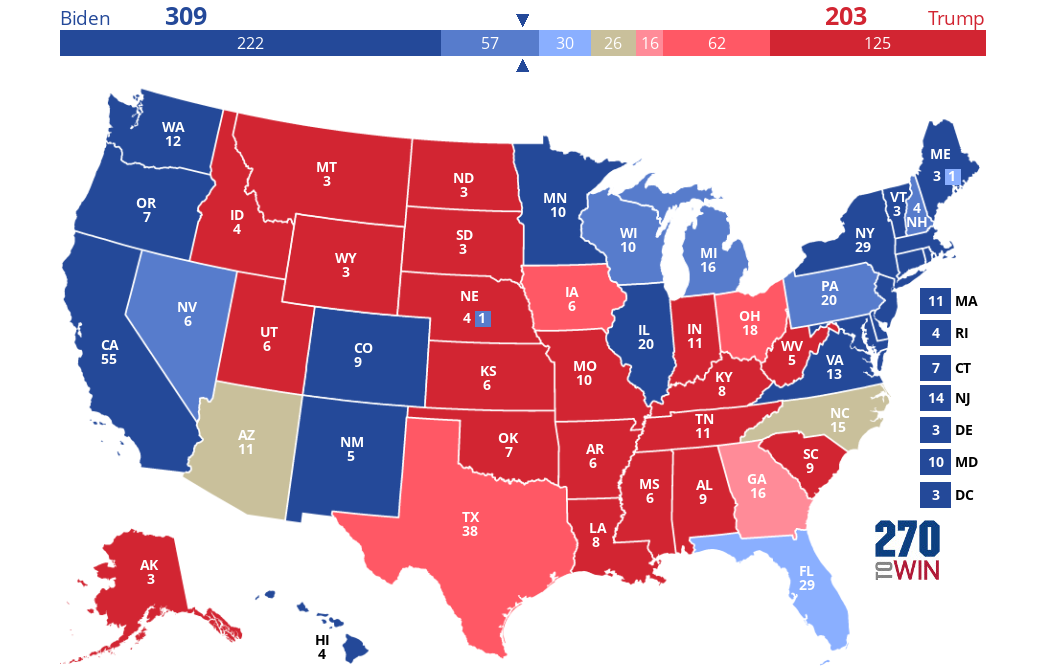
The first map is a state-by-state display of current probabilities, and represents the single most probable combination (the "mode"). The other two maps take a look at the map if either Biden or Trump were to outperform in the polls by 3%, the amount by which polls and results differed in 2016 in terms of PEC's Meta-Margin tracker.
Note that the aggregate at PEC displays the median electoral vote count from all possibilities. As such, it will often differ from the mode.
These maps will be updated daily. Click or tap any of them for an interactive version as well as the changes over time.
Baseline: State-by-state likelihood for Biden or Trump victory based on current polling.
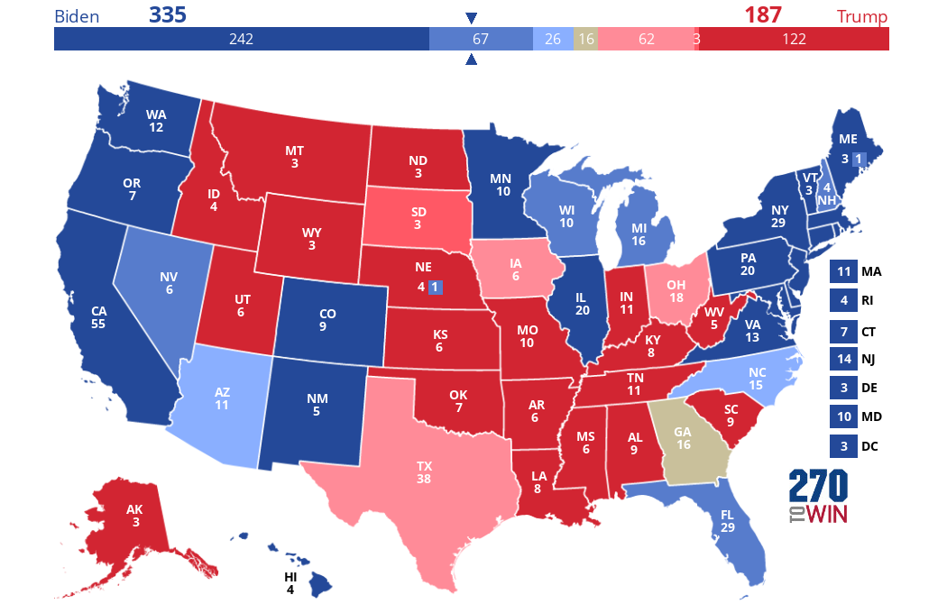
Biden Outperforms: How the map shifts if Biden outperforms polling by 3%.
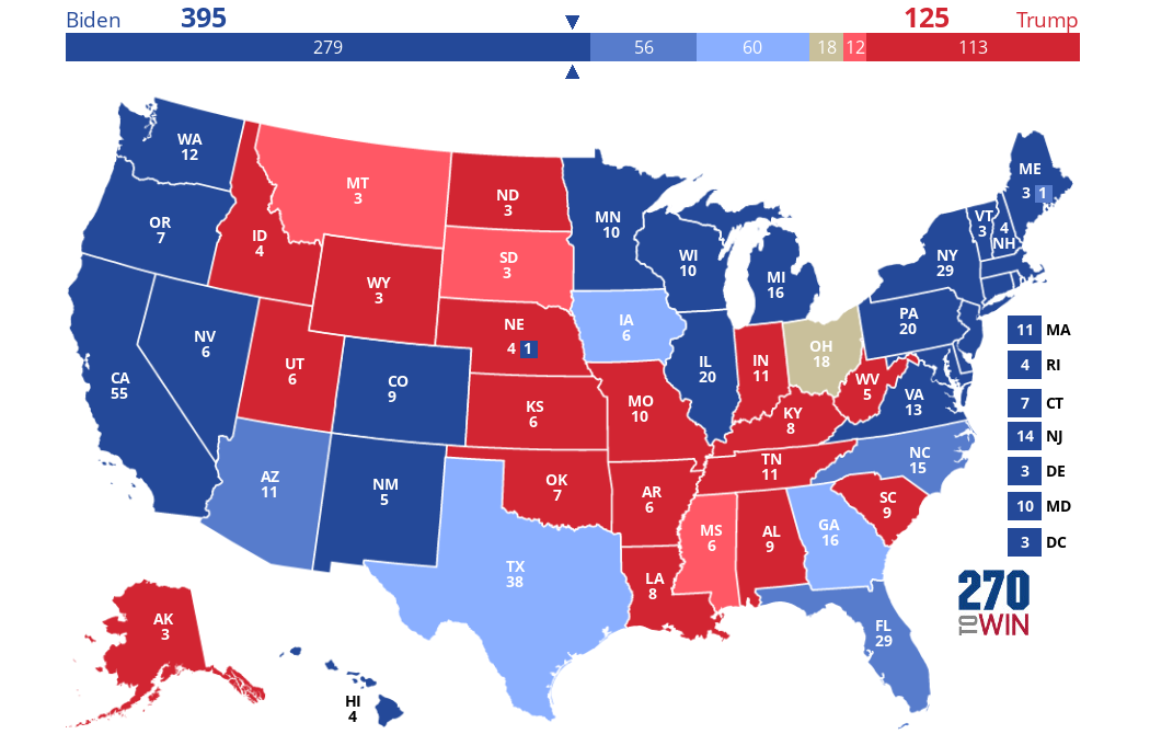
Trump Outperforms: How the map shifts if Trump outperforms polling by 3%.