2018 Senate Election Forecasts
These maps reflect the ratings of a number of quantitative and qualitative forecasters, as well as some consensus projections. Click or tap any of the thumbnails for an interactive version that you can use to create and share your own 2018 Senate forecast.
Election Day Live Results: Choose a map to follow along as the votes are counted and races are called.
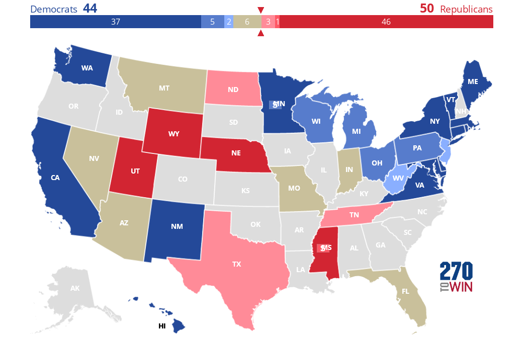
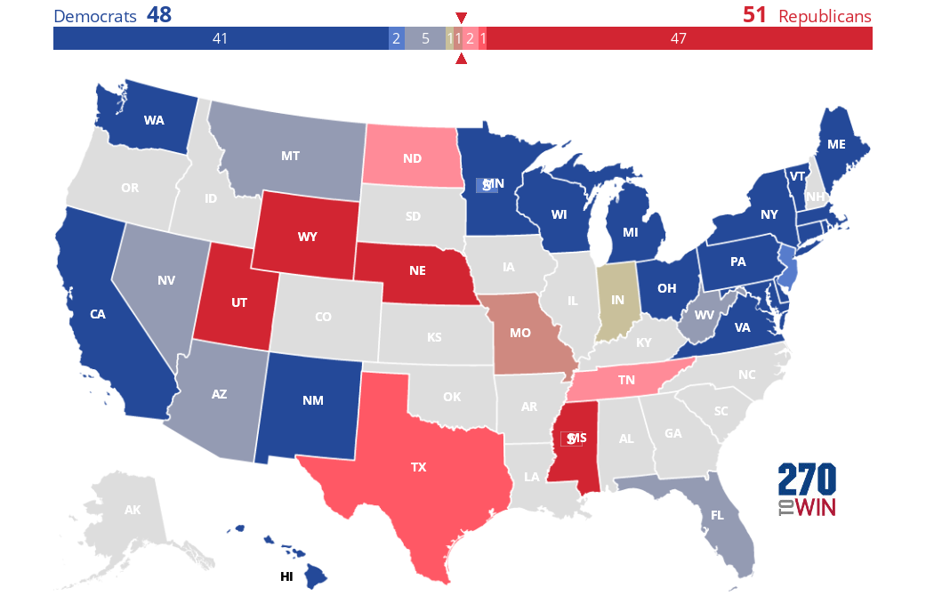
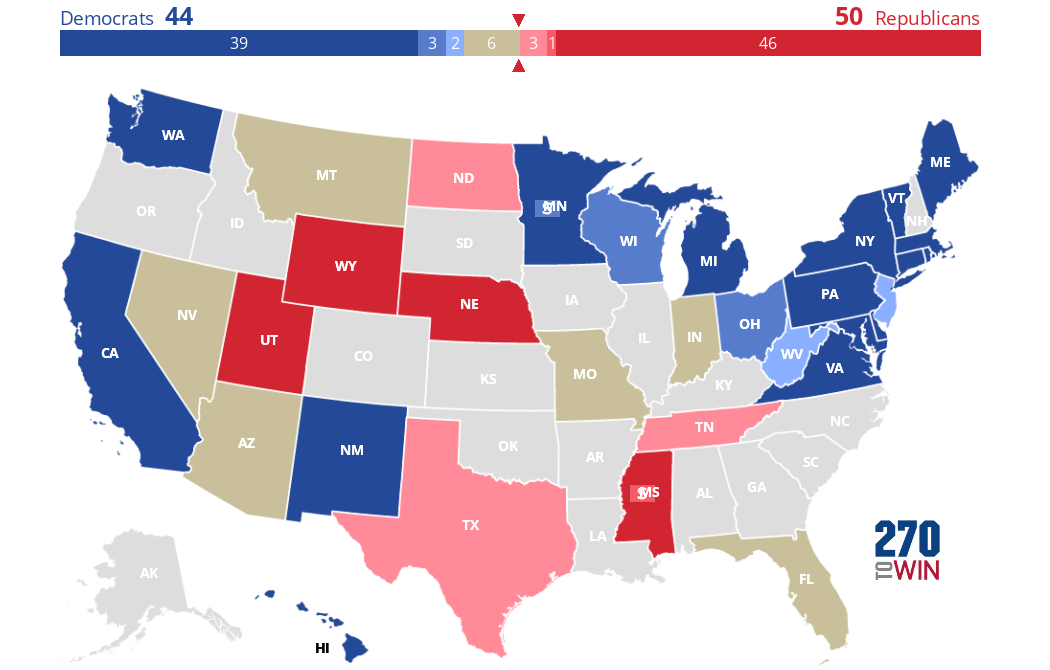
2018 Senate Elections: Consensus Forecast
A consensus outlook for the 2018 Senate elections based on the current ratings of Sabato's Crystal Ball, The Cook Political Report, and Inside Elections. For purposes of this map, only states rated safe by all three of these forecasters are shown in the darkest shade.
Use this map as a starting point to create and share your own 2018 Senate forecast.
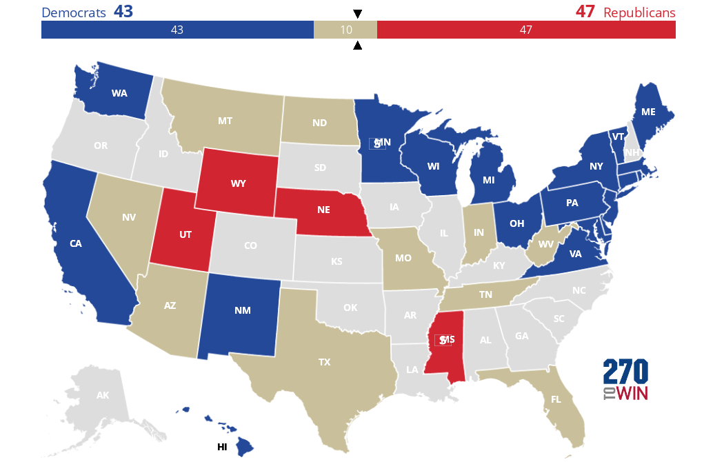
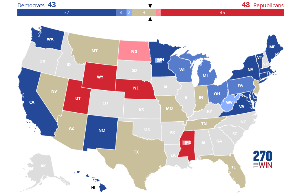
2018 Senate Battleground Map
The states shown in tan are those likely to be the most closely-contested in the 2018 Senate elections. They are where the Battle for Control of the Senate is likely to be decided.
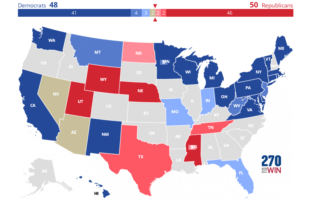
Crystal Ball 2018 Senate Ratings
The final 2018 Senate race ratings from Sabato's Crystal Ball. Use their map as a starting point to create and share your own 2018 Senate forecast.
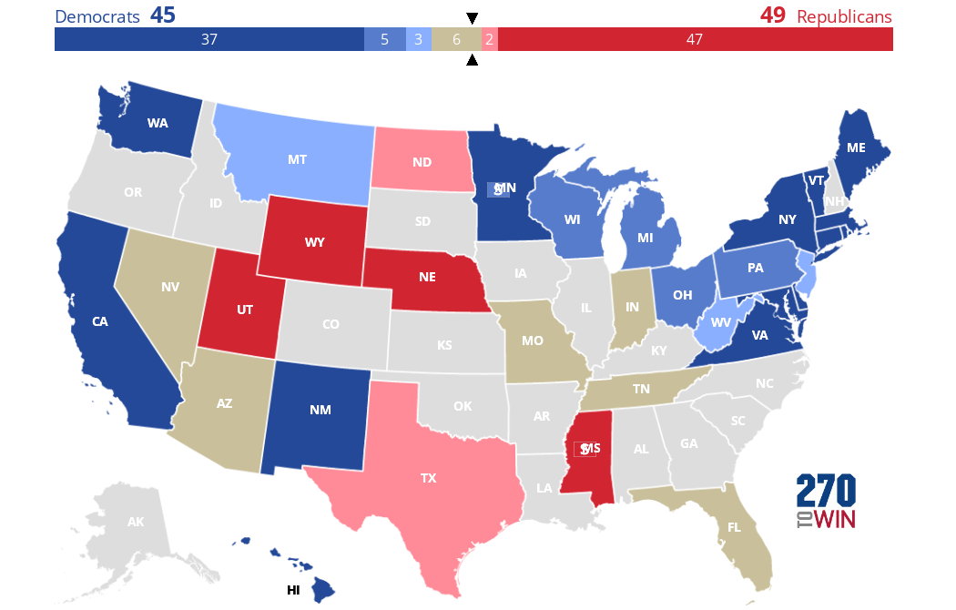
Inside Elections 2018 Senate Ratings
The final 2018 Senate forecast from Inside Elections (formerly The Rothenberg & Gonzales Political Report). Use this as a starting point to create and share your own 2018 Senate forecast.
Cook Political Report 2018 Senate Ratings
The final 2018 Senate forecast from The Cook Political Report. Use this as a starting point to create and share your own 2018 Senate forecast.
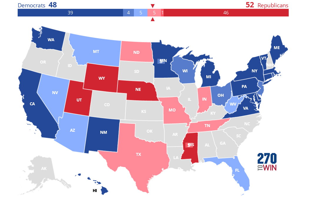
FiveThirtyEight Senate Forecast
This is a Senate forecast map derived from the probabilities associated with the FiveThirtyEight Senate Forecast (Classic Version). Use this map as a starting point to create and share your own 2018 House forecast.
The toss-up tan color is used when neither party has a 60% or higher chance of winning. The colored gradients are used to show higher Democratic and Republican probabilities, deepening as the chance of winning increases: Leans (60%+), Likely (75%+), Safe (95%+). These ranges match those used on the FiveThirtyEight site.
The map reflects the model output as of the timestamp below it.

Politico Predicts: Senate Ratings
Final Senate race ratings from Politico. Use this as a starting point to create and share your own 2018 Senate forecast.
CNN Key Races: 2018 Senate Ratings
The final 2018 Senate forecast from CNN. Use this as a starting point to create and share your own 2018 Senate forecast.
Daily Kos 2018 Senate Ratings
Final projection for the 2018 Senate election from Daily Kos. Use this as a starting point to create and share your own 2018 Senate forecast.